deal order · empty
04 · Process
designed for confidence.
Research the real anxieties, prototype the transparent flow, and validate it sprint by sprint.
in their own words
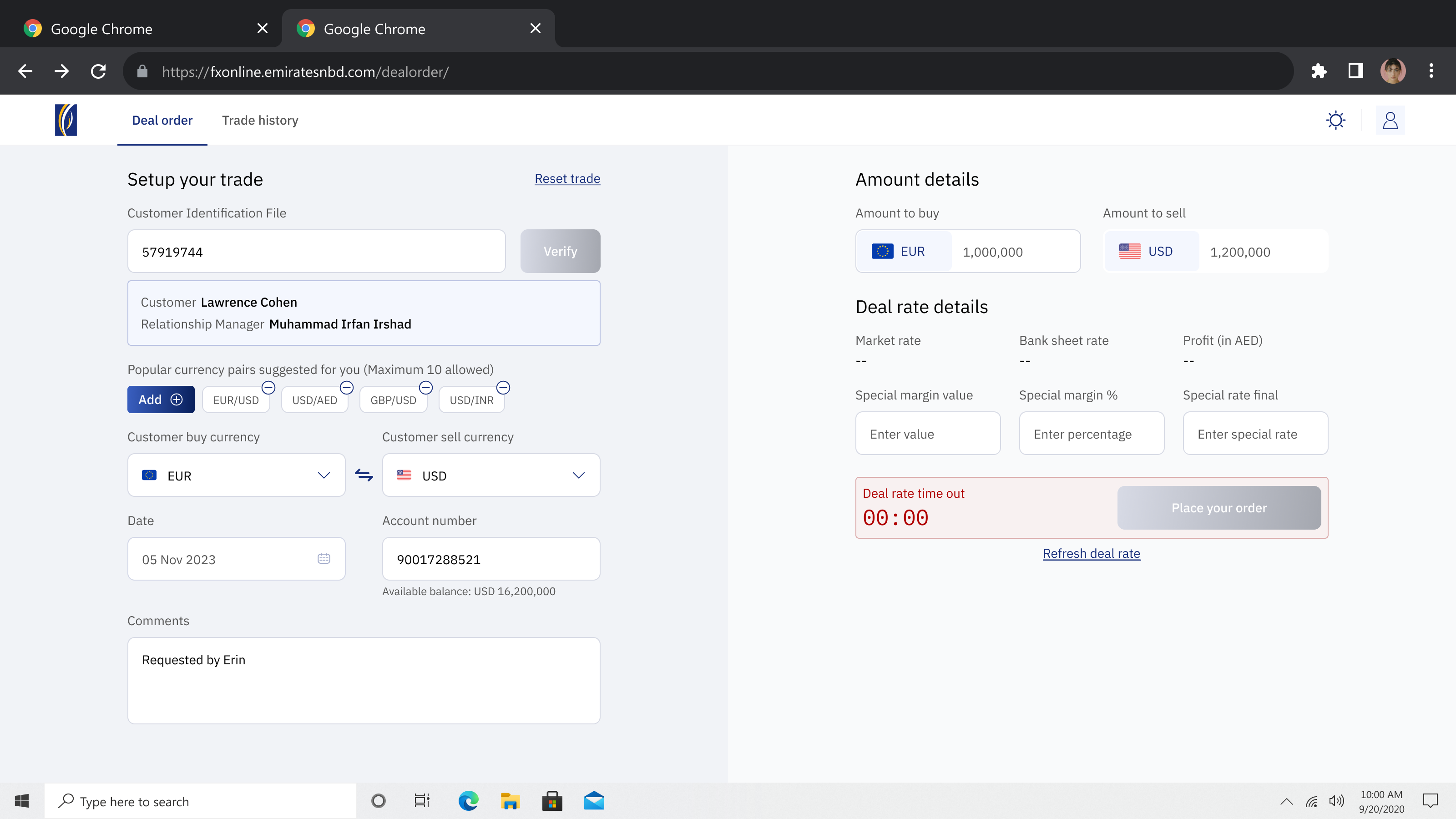
“By the time I confirm the rate, it's moved, and I've lost face with the client.”
Rashed A.Relationship Manager · Corporate
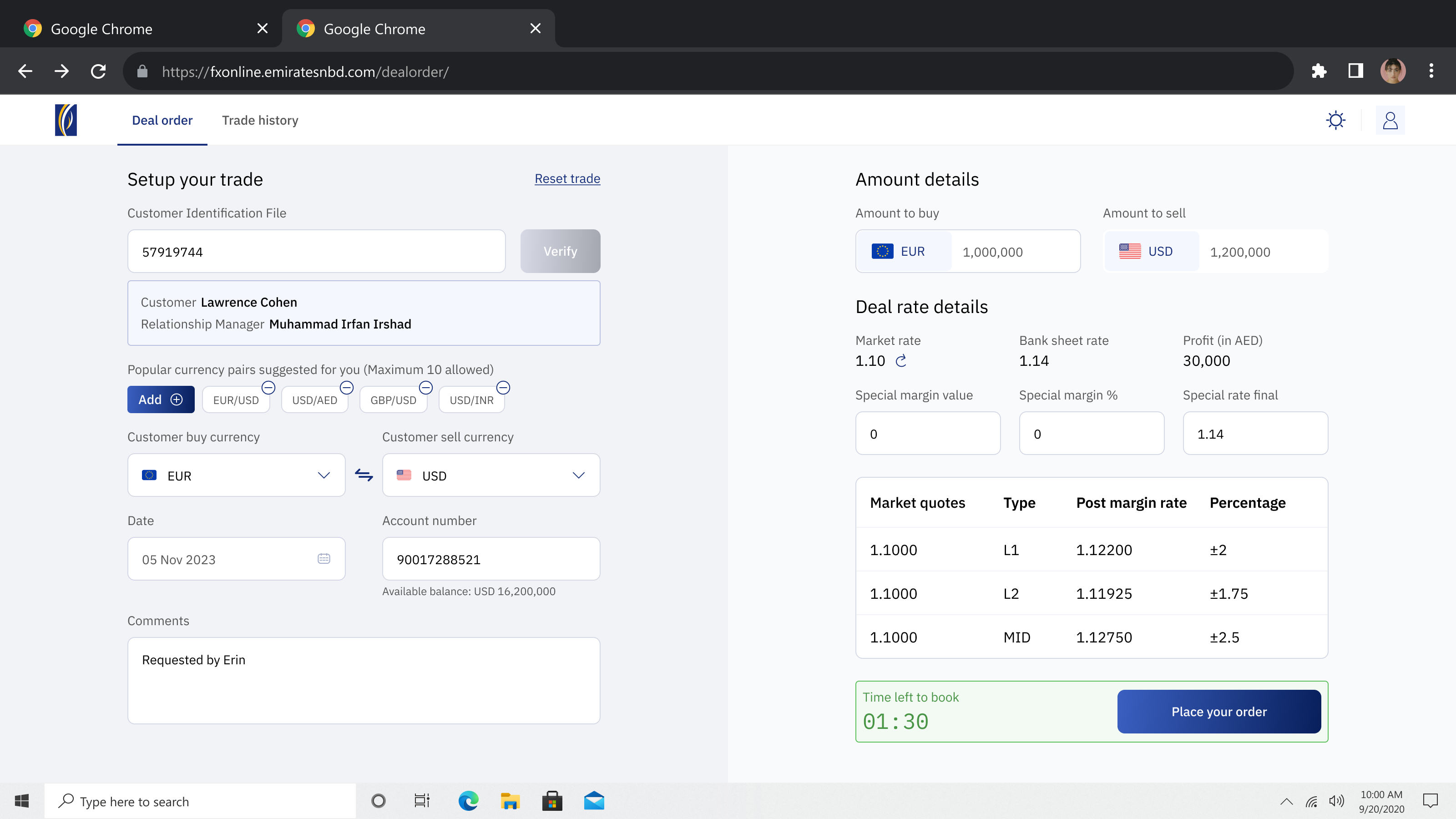
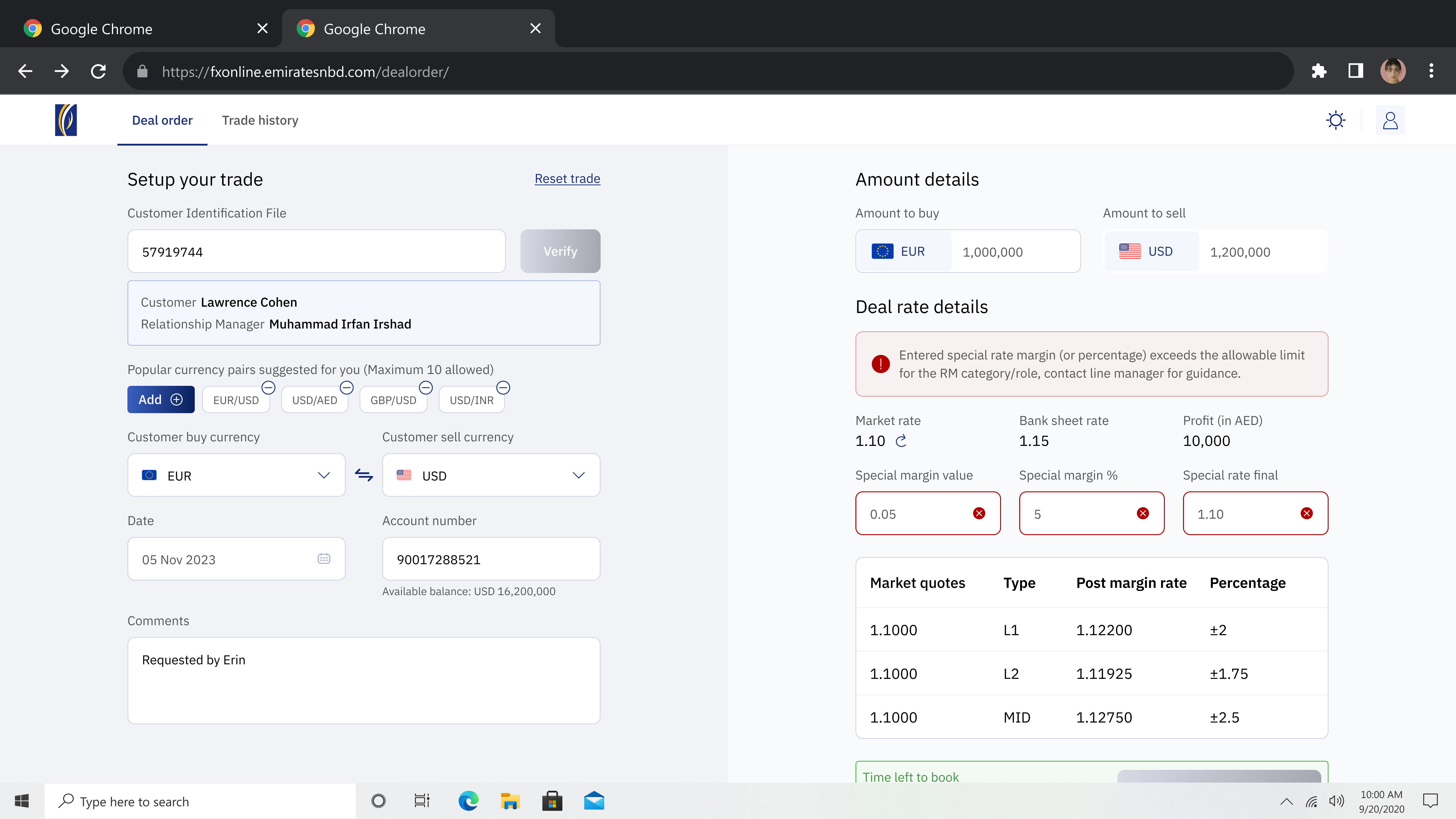
“I need market rate, margin and profit on one screen, or I'm booking blind.”
Lena H.Treasury Trader
“If a special rate breaches my authority, I need to know before I book, not after.”
Omar S.Senior RM · Special rates
the bet
Burying fees until checkout nudges conversion short-term. I showed rate, fee and final amount together instead, total cost upfront, because trust is the whole product.
find the real fear
Interviews showed the blocker wasn't speed, it was not trusting the rate and fearing hidden fees.
prototype the transparent quote
Designed a quote that shows rate, fee and exact amount received together, with a locked-rate countdown.
validate with real users
Usability-tested the transparent flow vs. the old one, faster transfers and far higher trust in the rate.
ship a responsive system
Delivered a responsive design system so the flow stayed consistent across mobile, tablet and desktop.