mobile app · enterprise banking · iOS & android
corporate banking, in your pocket.
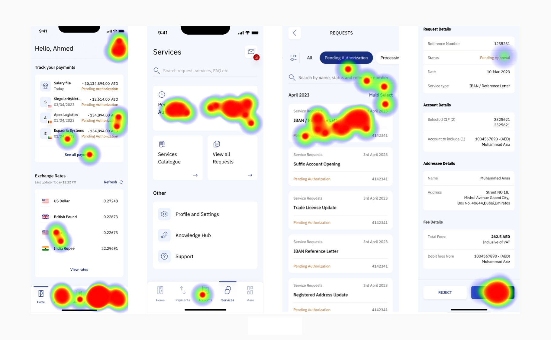
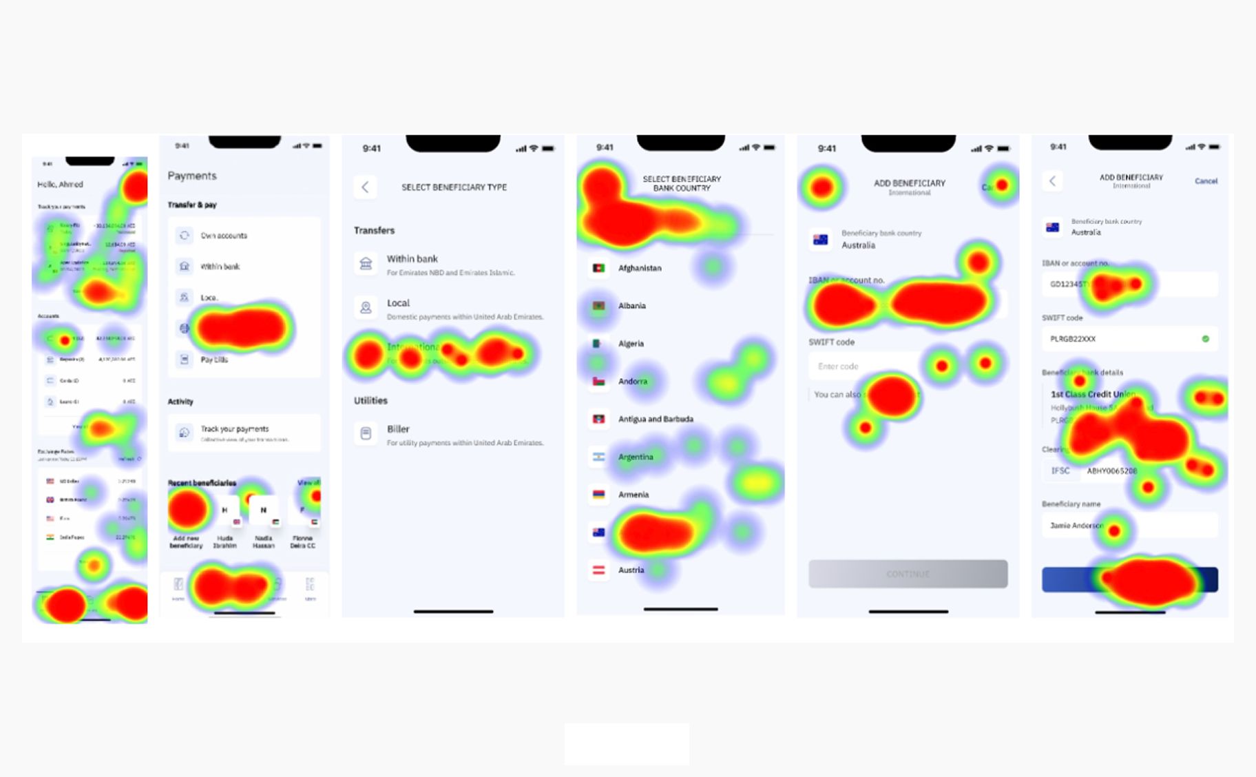
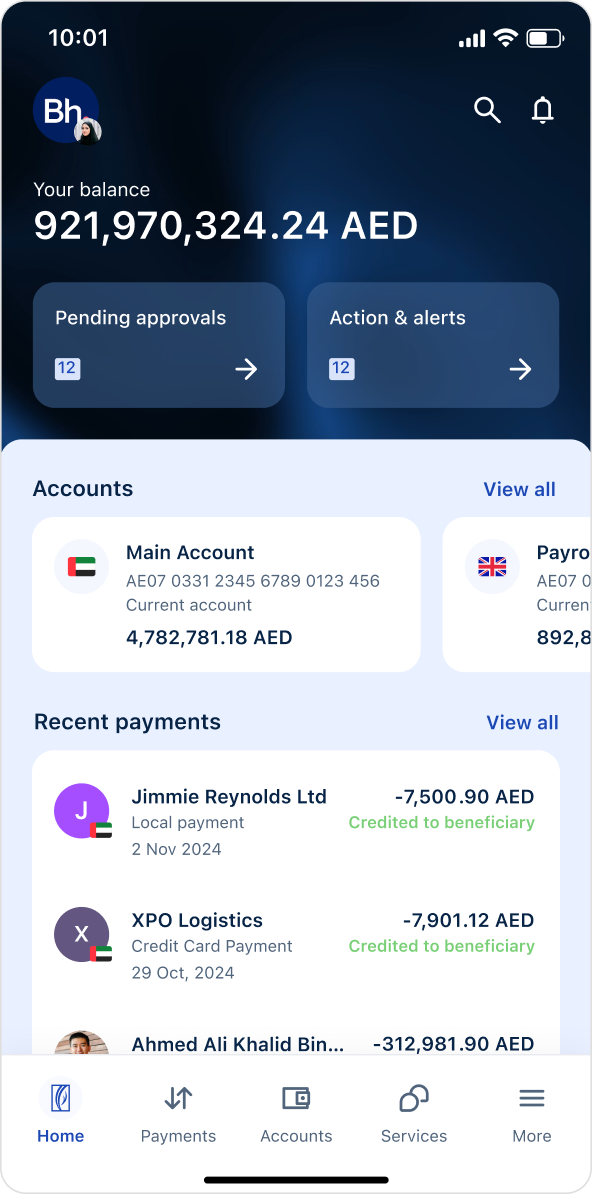
Emirates NBD's corporate banking app for business users across the MENA region. Corporate authorizers were tied to desktop for time-sensitive payments. Within a four-designer team, I owned the maker-checker-authorizer experience and device activation, translating a dense desktop system into role-specific iOS and Android journeys.


70%↑
Faster delivery, by aligning design sprints with engineering readiness.
Delivery
3×↑
Faster task completion in key journeys like approvals and beneficiary management.
Speed
500+↑
Screens designed across end-to-end journeys.
Scale
12↑
End-to-end journeys created, including dashboard, login and payments.
Coverage